Overview
The Dashboard provides a customizable view of your evaluation metrics through configurable charts. Each user can create their own personalized dashboard to track model performance, compare test suites, and monitor trends over time.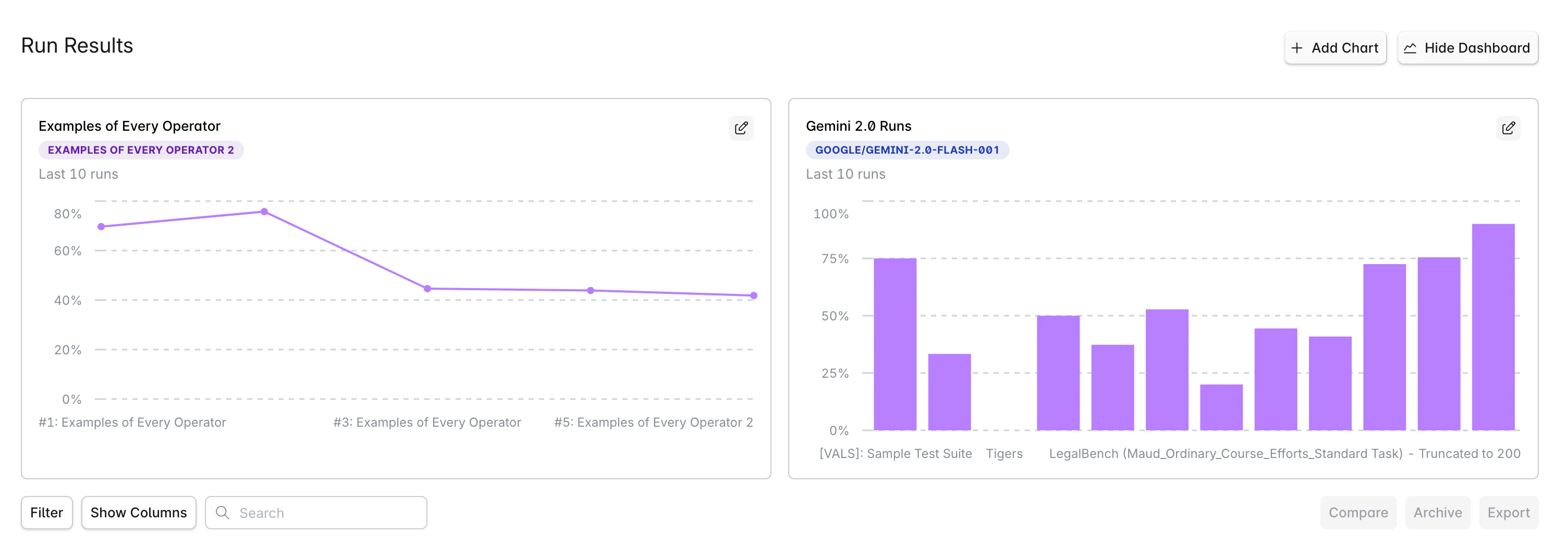
Getting Started
Accessing the Dashboard
- Navigate to Run Results in your project
- Click the Dashboard button in the top-right corner
- The dashboard view will display your configured charts
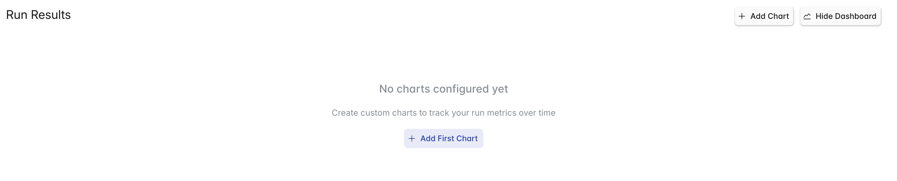
Creating Your First Chart
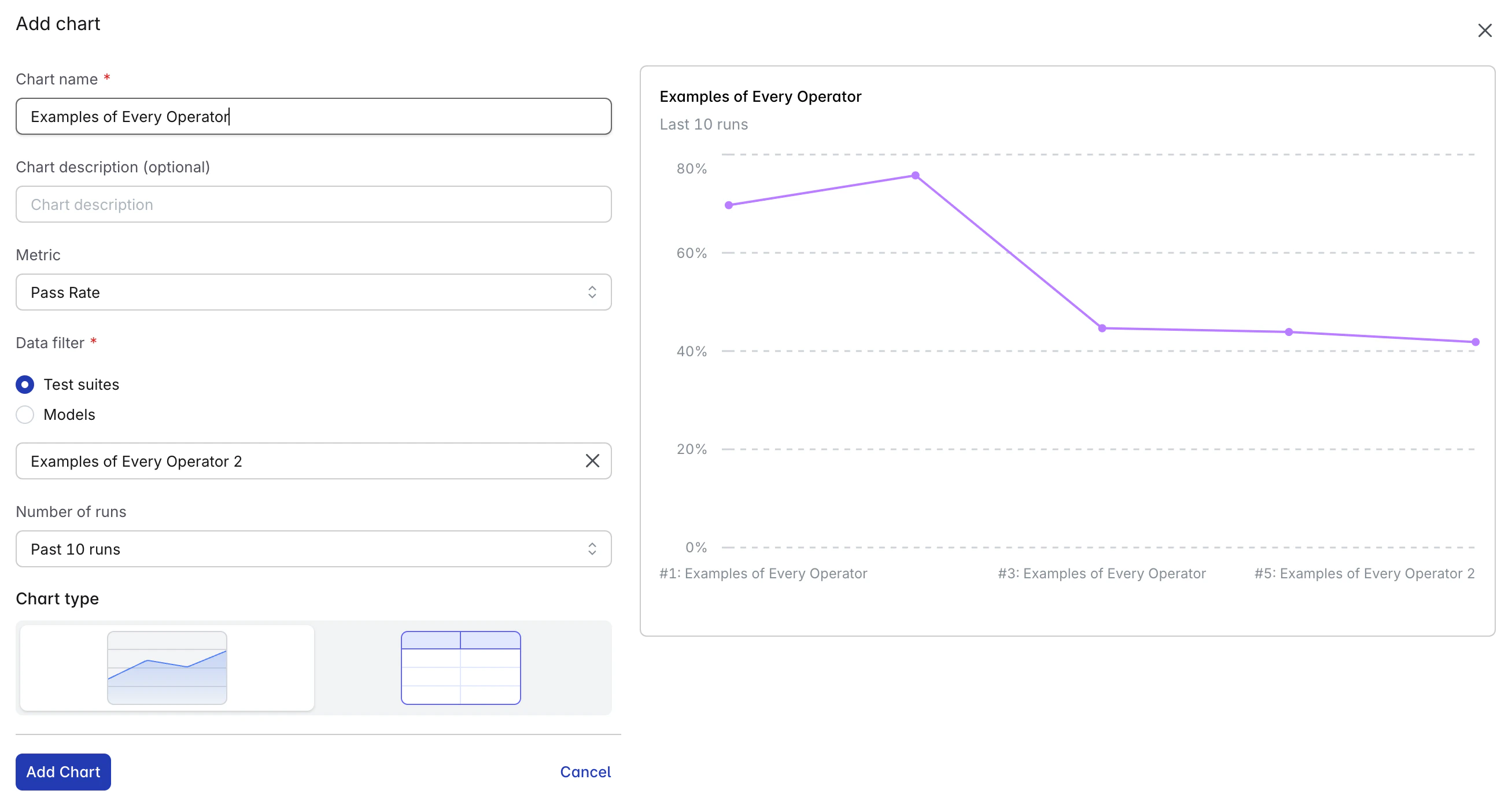
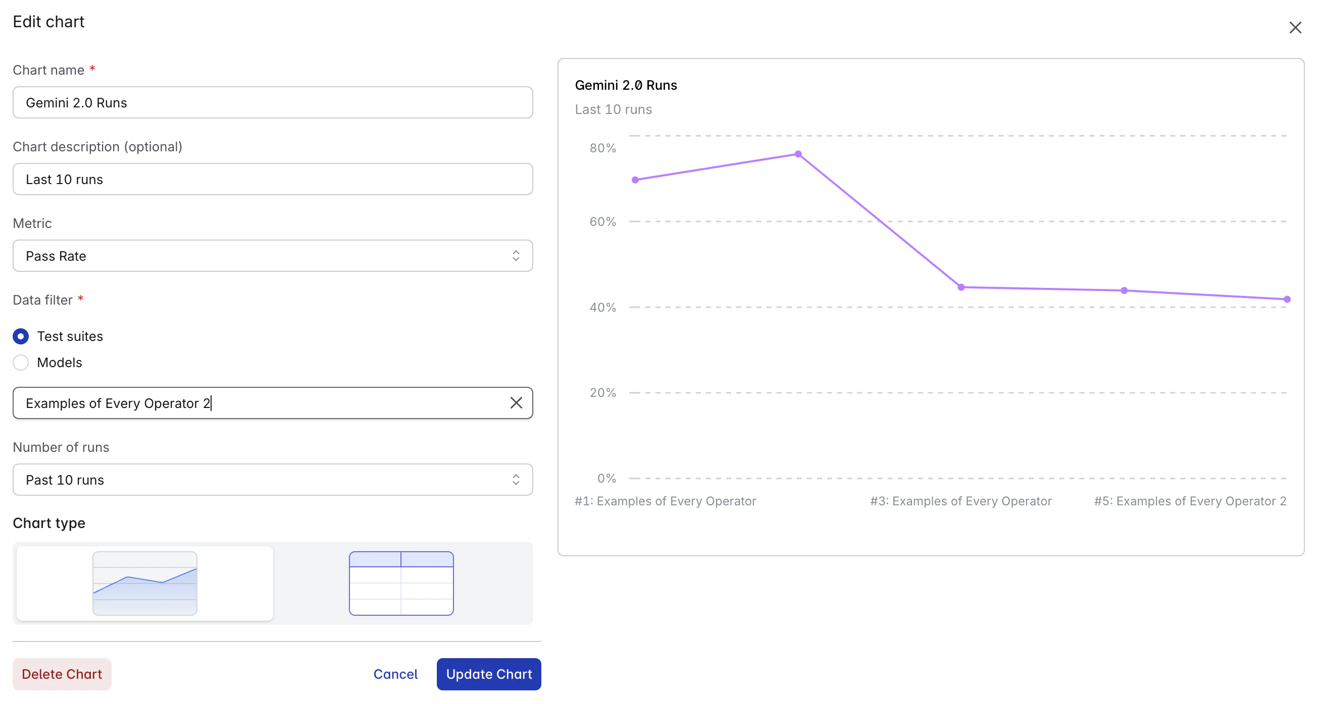
When you first open the dashboard, you’ll see an empty state with an Add First Chart button:- Click Add First Chart or the Add Chart button
- Configure your chart in the modal:
- Title: Give your chart a descriptive name
- Chart Description (optional): Add context or description
- Metric: Select from Pass Rate or Success Rate
- Chart Type: Choose Line, Bar, or Table
- Data Filter: Configure data sources and comparisons
- Number of Runs (optional): Number of recent runs to display (default: 10)
- Comparing data (for Model Data Filter): Compare data across different models
- Click Add Chart to add the chart
Available Metrics
Pass Rate
Percentage of tests passing all checks. This is the primary metric for evaluating model performance.Success Rate
Percentage of runs completing successfully without errors. Useful for monitoring system reliability.Chart Types
Line Chart
Best for visualizing trends over time. Shows how metrics change across multiple runs.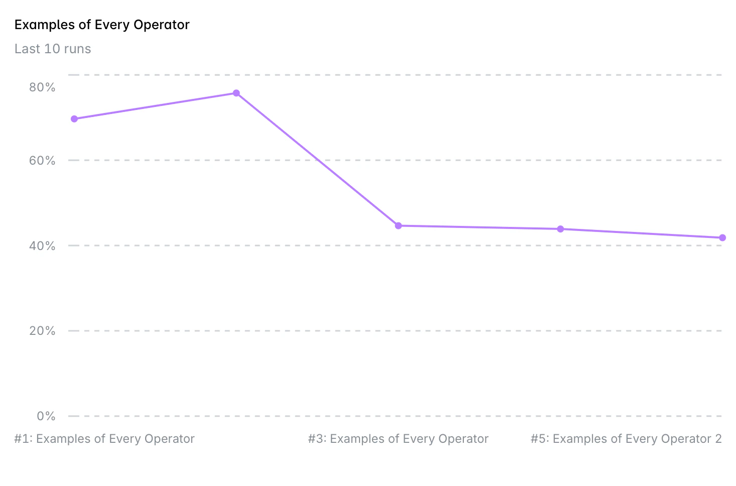
Bar Chart
Effective for comparing discrete values side-by-side. Ideal for model or test suite comparisons.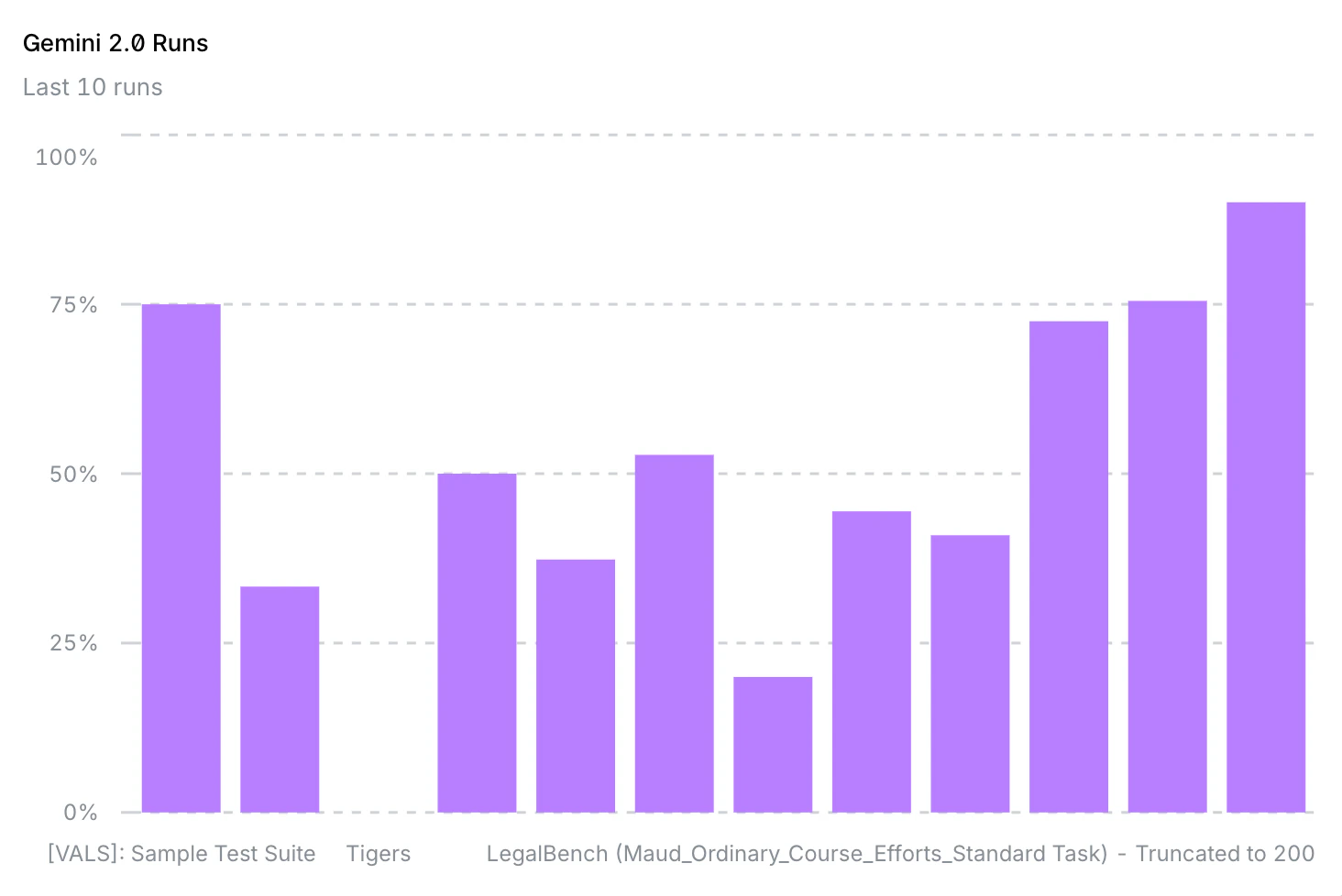
Table View
Displays detailed data in a structured format. Useful for precise values.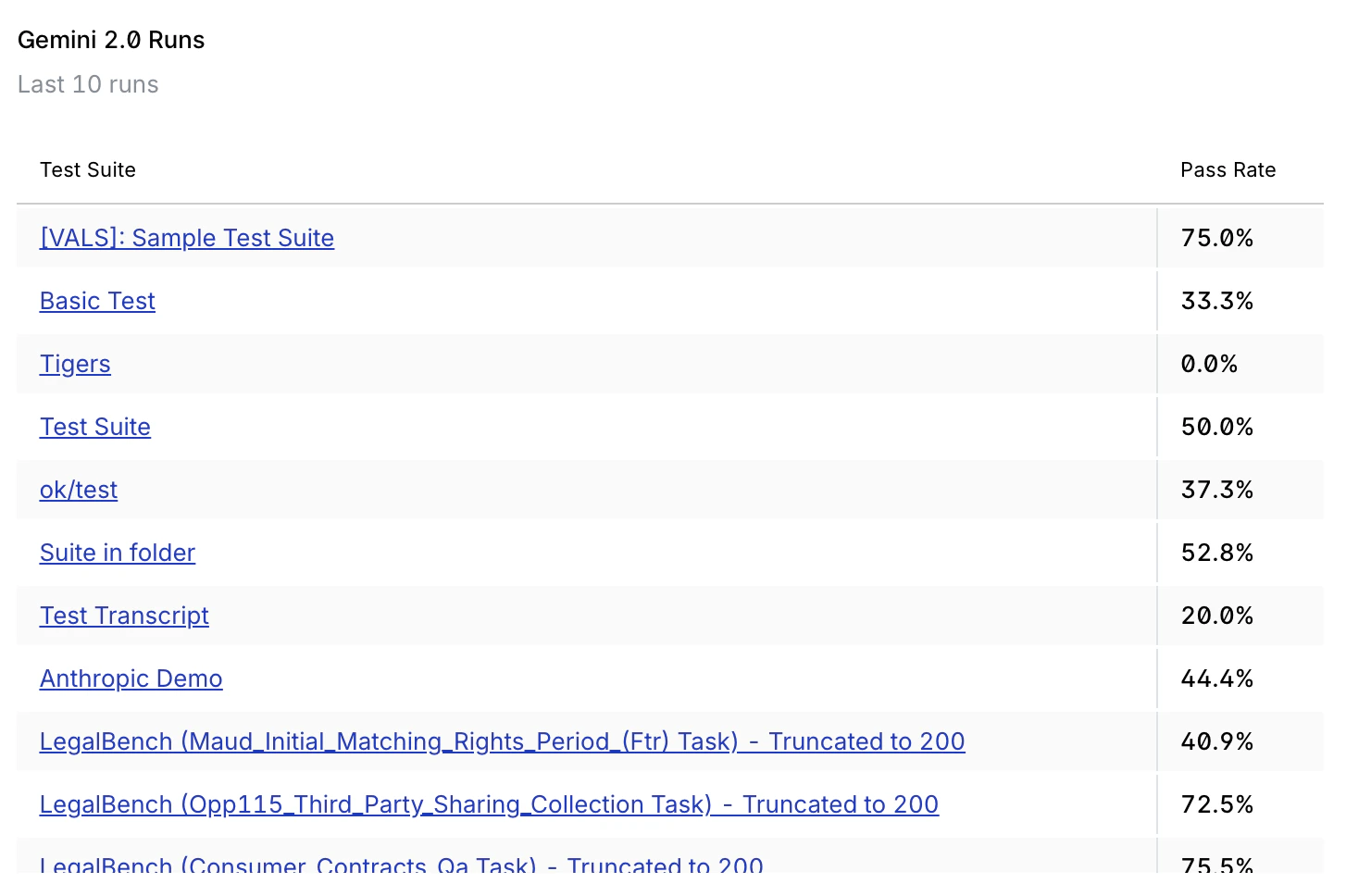
Filtering and Comparisons
Basic Filtering
- Test Suite: Select a specific test suite to analyze
- Model: Choose which model to track
- Run Count: Number of recent runs to display (default: 10)
- Specific Runs: Optionally select specific run IDs
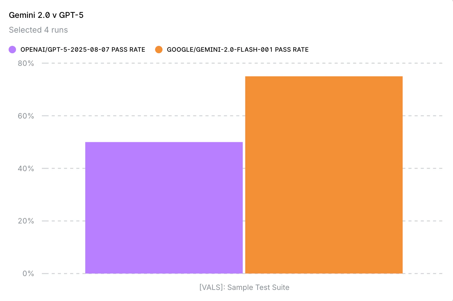
Model Comparison
Compare multiple models on the same test suite:- In the chart configuration, select your primary model
- Add comparison models using the multi-select field
- Each model will appear as a separate series on the chart
Managing Charts
Editing Charts
- Hover over any chart to reveal the edit button (pencil icon)
- Click to open the edit modal
- Modify configuration as needed
- Click Update to save changes
Deleting Charts
- Open the edit modal for the chart
- Click Delete Chart at the bottom
- Confirm deletion
Chart Layout
Charts are displayed in a responsive 2-column grid on desktop and single column on mobile. Charts maintain their order based on creation time.Best Practices
Chart Organization
- Use descriptive titles: Make it immediately clear what each chart tracks
- Add chart description: Provide context about filters or comparisons
- Limit comparisons: 3-5 items maximum for readability
- Group related charts: Place similar metrics near each other
Performance Monitoring
- Create baseline charts: Track core metrics consistently
- Set appropriate run counts: 10-30 runs typically provide good visibility
- Use both metrics: Balance pass rate with success rate
- Regular reviews: Check dashboard daily or weekly
Team Collaboration
- Document purposes: Use chart description to explain why a chart exists
- Create role-specific views: Different team members may need different metrics
Limitations
- Maximum 50 charts per dashboard
- Run count limited to 100 for performance
- Up to 10 items in comparisons
- Dashboard is user-specific (not shared across team)
- Real-time updates require page refresh
- Currently supports 2 metrics (Pass Rate, Success Rate)