> ## Documentation Index
> Fetch the complete documentation index at: https://docs.vals.ai/llms.txt
> Use this file to discover all available pages before exploring further.
# Dashboard
## Overview
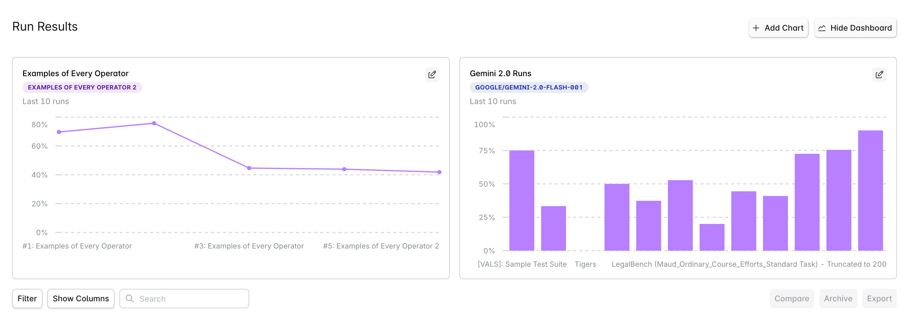
The Dashboard provides a customizable view of your evaluation metrics through configurable charts. Each user can create their own personalized dashboard to track model performance, compare test suites, and monitor trends over time.
 ## Getting Started
### Accessing the Dashboard
1. Navigate to **Run Results** in your project
2. Click the **Dashboard** button in the top-right corner
3. The dashboard view will display your configured charts
## Getting Started
### Accessing the Dashboard
1. Navigate to **Run Results** in your project
2. Click the **Dashboard** button in the top-right corner
3. The dashboard view will display your configured charts
 ### Creating Your First Chart
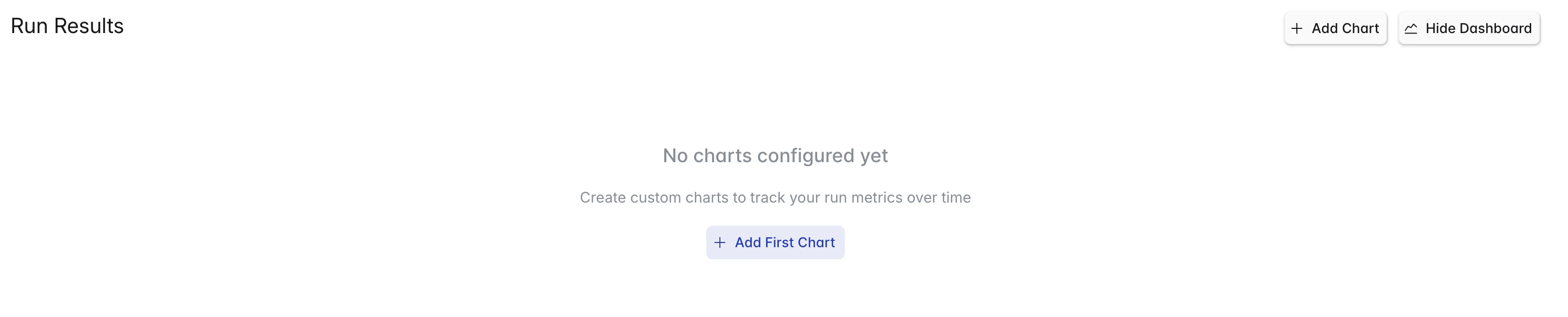
When you first open the dashboard, you'll see an empty state with an **Add First Chart** button:
1. Click **Add First Chart** or the **Add Chart** button
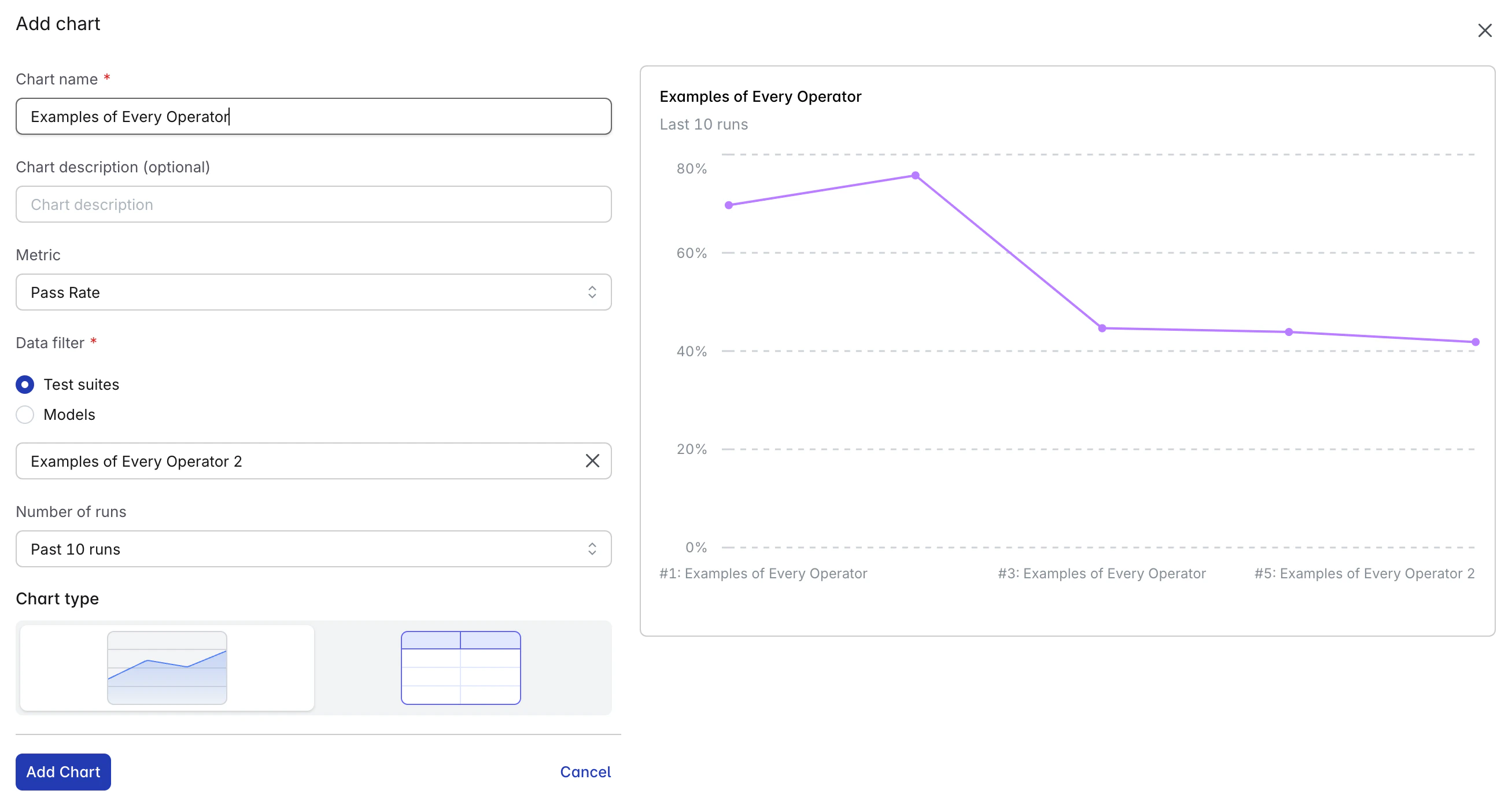
2. Configure your chart in the modal:
* **Title**: Give your chart a descriptive name
* **Chart Description** (optional): Add context or description
* **Metric**: Select from Pass Rate or Success Rate
* **Chart Type**: Choose Line, Bar, or Table
* **Data Filter**: Configure data sources and comparisons
* **Number of Runs** (optional): Number of recent runs to display (default: 10)
* **Comparing data** (for Model Data Filter): Compare data across different models
3. Click **Add Chart** to add the chart
### Creating Your First Chart
When you first open the dashboard, you'll see an empty state with an **Add First Chart** button:
1. Click **Add First Chart** or the **Add Chart** button
2. Configure your chart in the modal:
* **Title**: Give your chart a descriptive name
* **Chart Description** (optional): Add context or description
* **Metric**: Select from Pass Rate or Success Rate
* **Chart Type**: Choose Line, Bar, or Table
* **Data Filter**: Configure data sources and comparisons
* **Number of Runs** (optional): Number of recent runs to display (default: 10)
* **Comparing data** (for Model Data Filter): Compare data across different models
3. Click **Add Chart** to add the chart
 ## Available Metrics
### Pass Rate
Percentage of tests passing all checks. This is the primary metric for evaluating model performance.
### Success Rate
Percentage of runs completing successfully without errors. Useful for monitoring system reliability.
## Chart Types
### Line Chart
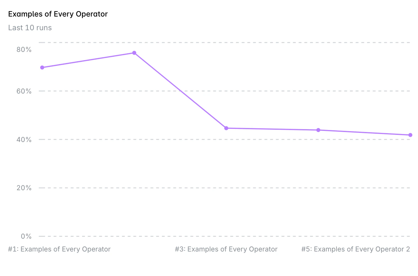
Best for visualizing trends over time. Shows how metrics change across multiple runs.
## Available Metrics
### Pass Rate
Percentage of tests passing all checks. This is the primary metric for evaluating model performance.
### Success Rate
Percentage of runs completing successfully without errors. Useful for monitoring system reliability.
## Chart Types
### Line Chart
Best for visualizing trends over time. Shows how metrics change across multiple runs.
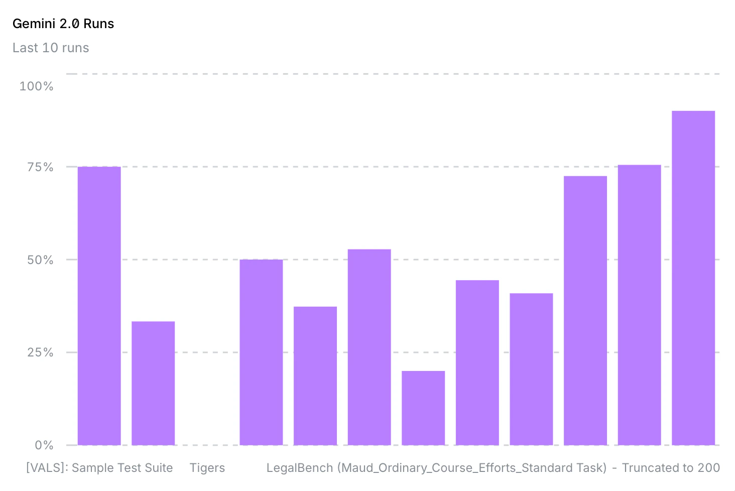
 ### Bar Chart
Effective for comparing discrete values side-by-side. Ideal for model or test suite comparisons.
### Bar Chart
Effective for comparing discrete values side-by-side. Ideal for model or test suite comparisons.
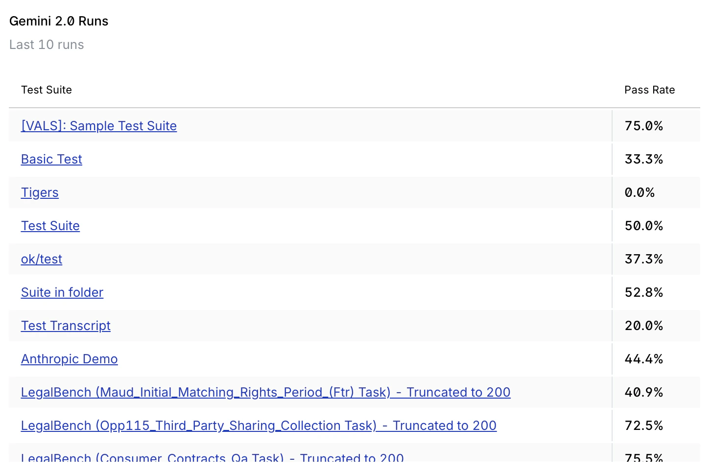
 ### Table View
Displays detailed data in a structured format. Useful for precise values.
### Table View
Displays detailed data in a structured format. Useful for precise values.
 ## Filtering and Comparisons
### Basic Filtering
* **Test Suite**: Select a specific test suite to analyze
* **Model**: Choose which model to track
* **Run Count**: Number of recent runs to display (default: 10)
* **Specific Runs**: Optionally select specific run IDs
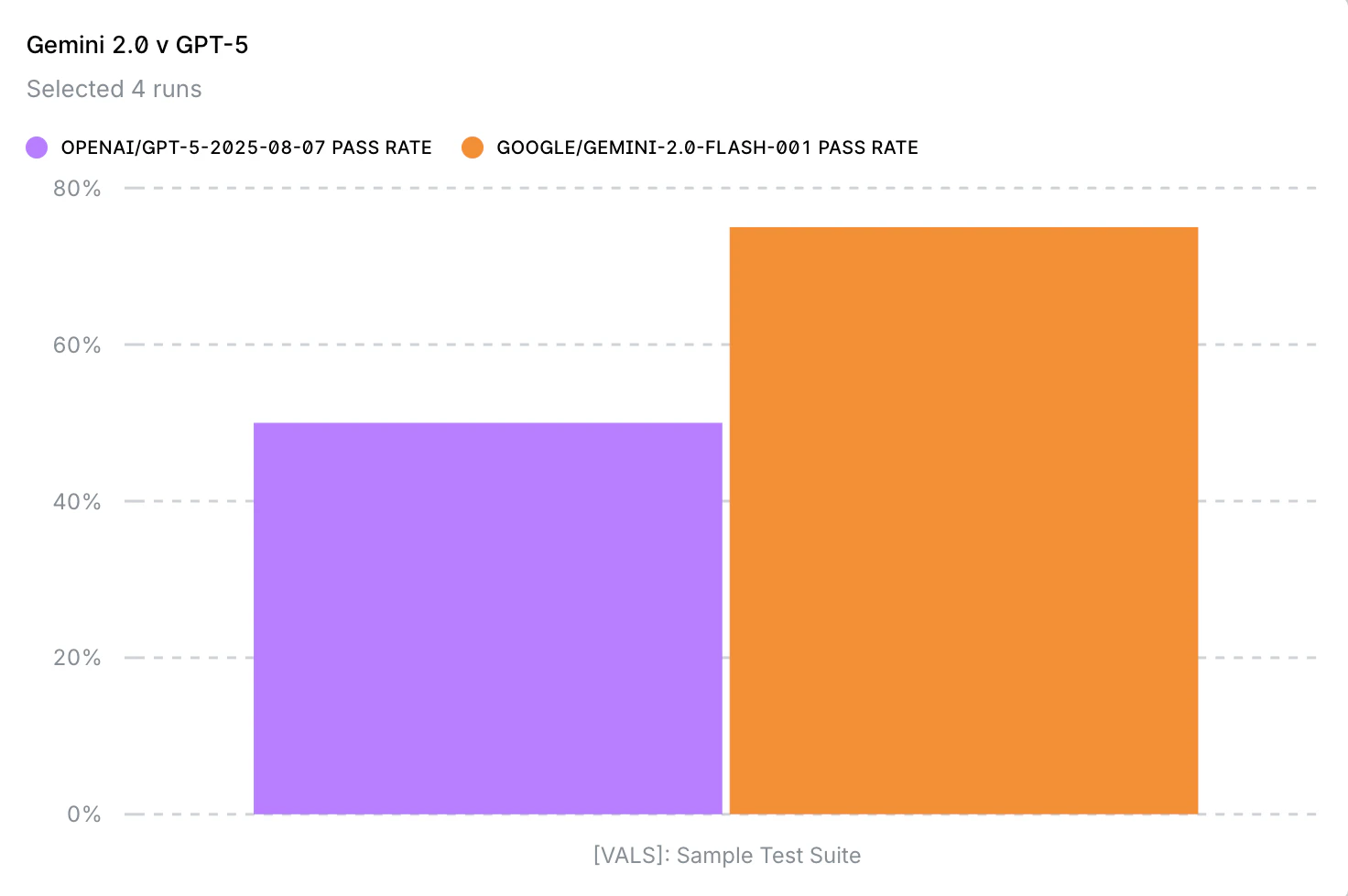
### Model Comparison
Compare multiple models on the same test suite:
1. In the chart configuration, select your primary model
2. Add comparison models using the multi-select field
3. Each model will appear as a separate series on the chart
## Filtering and Comparisons
### Basic Filtering
* **Test Suite**: Select a specific test suite to analyze
* **Model**: Choose which model to track
* **Run Count**: Number of recent runs to display (default: 10)
* **Specific Runs**: Optionally select specific run IDs
### Model Comparison
Compare multiple models on the same test suite:
1. In the chart configuration, select your primary model
2. Add comparison models using the multi-select field
3. Each model will appear as a separate series on the chart
 ## Managing Charts
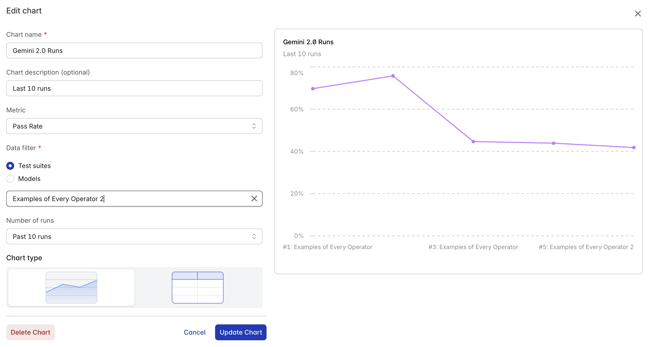
### Editing Charts
1. Hover over any chart to reveal the edit button (pencil icon)
2. Click to open the edit modal
3. Modify configuration as needed
4. Click **Update** to save changes
## Managing Charts
### Editing Charts
1. Hover over any chart to reveal the edit button (pencil icon)
2. Click to open the edit modal
3. Modify configuration as needed
4. Click **Update** to save changes
 ### Deleting Charts
1. Open the edit modal for the chart
2. Click **Delete Chart** at the bottom
3. Confirm deletion
### Chart Layout
Charts are displayed in a responsive 2-column grid on desktop and single column on mobile. Charts maintain their order based on creation time.
## Best Practices
### Chart Organization
* **Use descriptive titles**: Make it immediately clear what each chart tracks
* **Add chart description**: Provide context about filters or comparisons
* **Limit comparisons**: 3-5 items maximum for readability
* **Group related charts**: Place similar metrics near each other
### Performance Monitoring
* **Create baseline charts**: Track core metrics consistently
* **Set appropriate run counts**: 10-30 runs typically provide good visibility
* **Use both metrics**: Balance pass rate with success rate
* **Regular reviews**: Check dashboard daily or weekly
### Team Collaboration
* **Document purposes**: Use chart description to explain why a chart exists
* **Create role-specific views**: Different team members may need different metrics
## Limitations
* Maximum 50 charts per dashboard
* Run count limited to 100 for performance
* Up to 10 items in comparisons
* Dashboard is user-specific (not shared across team)
* Real-time updates require page refresh
* Currently supports 2 metrics (Pass Rate, Success Rate)
### Deleting Charts
1. Open the edit modal for the chart
2. Click **Delete Chart** at the bottom
3. Confirm deletion
### Chart Layout
Charts are displayed in a responsive 2-column grid on desktop and single column on mobile. Charts maintain their order based on creation time.
## Best Practices
### Chart Organization
* **Use descriptive titles**: Make it immediately clear what each chart tracks
* **Add chart description**: Provide context about filters or comparisons
* **Limit comparisons**: 3-5 items maximum for readability
* **Group related charts**: Place similar metrics near each other
### Performance Monitoring
* **Create baseline charts**: Track core metrics consistently
* **Set appropriate run counts**: 10-30 runs typically provide good visibility
* **Use both metrics**: Balance pass rate with success rate
* **Regular reviews**: Check dashboard daily or weekly
### Team Collaboration
* **Document purposes**: Use chart description to explain why a chart exists
* **Create role-specific views**: Different team members may need different metrics
## Limitations
* Maximum 50 charts per dashboard
* Run count limited to 100 for performance
* Up to 10 items in comparisons
* Dashboard is user-specific (not shared across team)
* Real-time updates require page refresh
* Currently supports 2 metrics (Pass Rate, Success Rate)